Brand Guide
Who We Are
Mission
Our History
What Sets Us Apart
Core Values
Community Strength
Creativity & Individuality
Brand Personality
Target Audience
Community Hub
Authentic Connection
Usage Rules
THINGS TO
AVOID
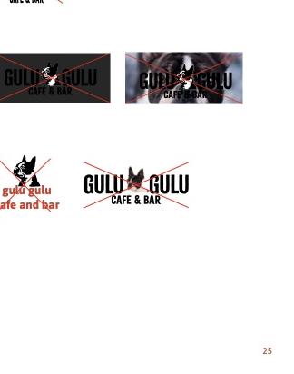
Avoid distorting the logo in any way, as this can make the mark and its type illegible.
Do not place the logo on a photo that is too busy or a background color that is too similar in value or hue; this risks the logo getting lost or becoming difficult to read.
Never alter the logo in any way. the goal is to keep things as much the same as we can across multiple platforms.
Primary Palette
The warm, rustic red represents the feeling you get when you're surrounded by good food, good drinks, and good company. The neutral browns are pulled from the base tones within the restaurant.
Secondary Palette
These lived-in, warmed up primaries are the first things you see when you scan the restaurant space.
Brand Typography
The selected typefaces should be used for all communications and collateral. They represent the brand's creative side, reminiscent of the typographic styles found in old show posters and flyers.
Citrus Gothic Solid
Titles & DisplayPrimary display typeface used for all titles. Reminiscent of old show posters and flyers.
Asap Bold
HeadlinesUsed for headlines and emphasis within body copy.
Asap Semi-Bold
SubheadingsUsed for subheadings and secondary emphasis.
Asap Regular
Body TextPrimary body text typeface for all communications and collateral.
Asap Italic
Emphasis & CaptionsUsed for emphasis within body text, captions, and attributions.
Brand Asset Library
Download official brand assets for use in your own materials. All files are approved for use per the brand guidelines. Always download the provided file instead of saving the preview image.
Logos
Official logo marks and wordmarks in various formats.

/full-logo-horizontal-black-fully-transparent-bg@2x.png)

Repeating Patterns
Seamless tileable patterns for print and digital use.